Sprat
Services
Identity Design
Packaging Design
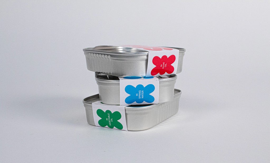
The sardine market is dominated by brands trying to look older than they are. What if there was a brand that tried to stand out rather than fit in? Introducing Sprat, a passion project of mine that imagines a sardine brand that’s actually cool.
Packaging dominated by simple, expressive typography - art directed photography with two sides, a vintage flair and an intoxicated blur - copy that’s super defensive about how people don’t like sardines. And above all, a loving tribute to a much-maligned font, Frankfurter.
Sprat
Services
Identity Design
Packaging Design
The sardine market is dominated by brands trying to look older than they are. What if there was a brand that tried to stand out rather than fit in? Introducing Sprat, a passion project of mine that imagines a sardine brand that’s actually cool.
Packaging dominated by simple, expressive typography - art directed photography with two sides, a vintage flair and an intoxicated blur - copy that’s super defensive about how people don’t like sardines. And above all, a loving tribute to a much-maligned font, Frankfurter.